Thursday 26 February 2015

Creative Expressions Thursday

Hello everyone

Thanks for all your kind comments on my card yesterday. Today is the turn of Creative Expressions and a step by step I did with the pet stamps that we used last month I thought I would show you this tutorial that was featured on the step by step worksheet we also create for from time to time I really loved this card I created and wanted to make sure you all got to see this one too for those who didn't see it featured on the worksheet.

So without further ado here is this cutie.

I loved creating this one I used the Paw print lattice background stamp with a resist technique with clear embossing powder on white card before the inking process.


So to start I took my Backing stamp and covered it in Perfect medium sticky embossing ink and coated a piece of white card stock  I used as detailed above the clear detail embossing powder form Creative Expressions and heat set it of course.


 Next using these four Distress inks I created a Backing wit more of the Bundled sage centrally and the oranges and the Vintage photo on the very edges.


Using Jet Black Archival ink of course I stamped out my Image called 'The Triplets'. I think of all the pet images we used for January this was my favourite for sure.I heat set it to stop the ink from smudging with water based ink. I also stamped a matching sentiment.

Using Distress markers I began colouring this one.


 I always try to use three of each shade to give shadows , highlights and a main colour. Its great fun adding tiny fur strokes and bringing these little fella's to life.


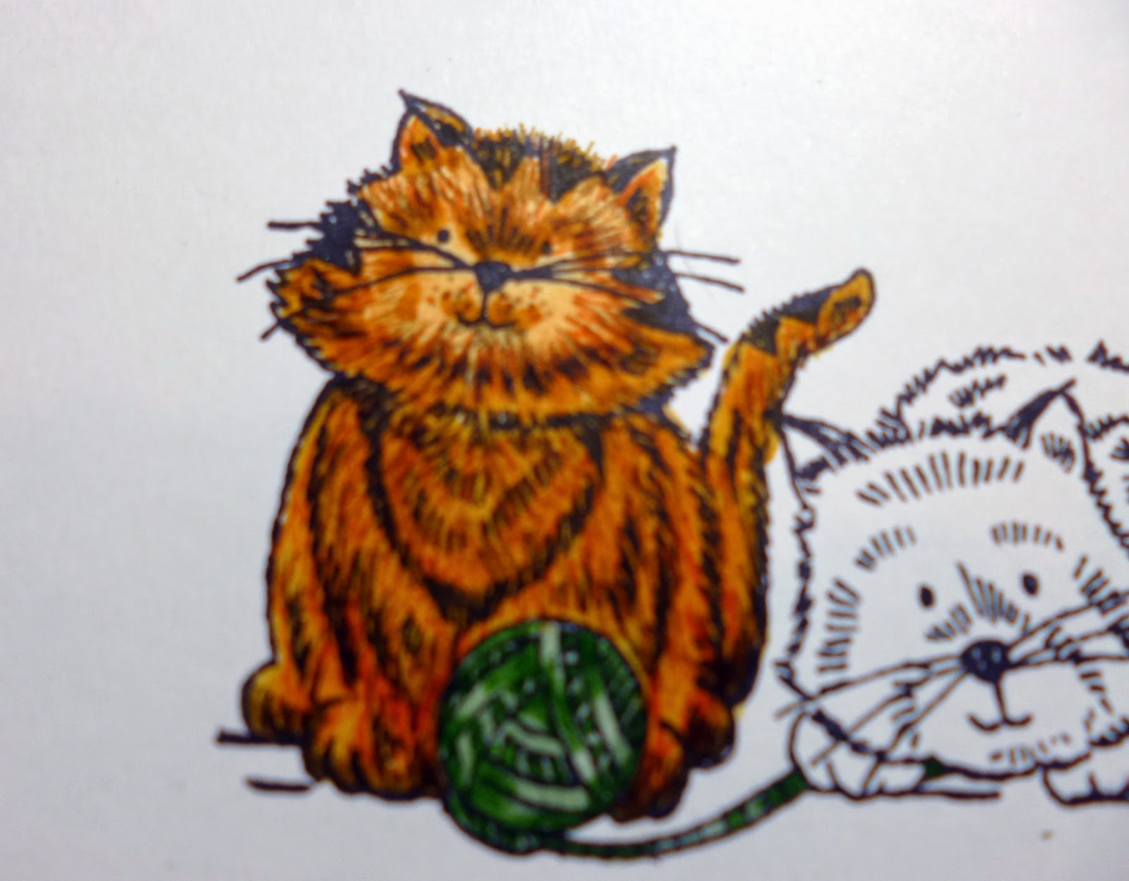
Each stroke of the fine tips adds depth and brings the character from a flat 2D image into a lifelike 3D image , I also used some white pen to open up the face and a white gel pen to add highlights in the fur also It is difficult for the camera to pick it up but it really does make a lot of difference and raise the image from the page creates the illusion to fool our eyes anyway.


I also added a shadow or two to ground the image and stop the cats looking like they were floating on the white back ground  I used again three shades of alcohol marker to 'ground' these playful little chaps. Once coloured I mounted each piece onto a thin border of black card.


After adding these onto black I took my background I created earlier and also added it to black card and made a slightly larger black and white mat also. Using foam on the inked back ground I added each piece together wrapping a piece of thick ribbon around the lattice piece also.


This is what the background should look like finished ready for the main image and sentiment.


I took a close up of the finished coloured image with shadows and highlights etc.


 I added my sentiment onto the ribbon strip and tied a matching bow with an opaque green dazzler to cover the knot. I cut the ends into forks for that real chocolate box shape bow.
I of course attached all the pieces using Cosmic shimmer glue which I love.


The finishing touches were just a few pearls and this little card was complete.


Here again is the completed image.
I was really pleased how this one turned out with its vibrant colours and how all the colours went together so well. I certainly never thought this ribbon would look so lovely on the card but I love it.
I hope you enjoyed how it was put together and the colours I used to colour the images and match the backings. They are some of my ultimate favourites to blend.

Have a wonderful Creative Expressions Thursday and I will speak to you all very soon, next months DT pack is so stunning and I love it so look out for the coming images from the team next month with all the gorgeous images.

Lots of love

Kim
XXXX

Wednesday 25 February 2015

Visible Image Wednesday

Hi Folks

Huge Good Mornings to all...

Today's card is something totally different and I hope you like it as it is using of course the fabulous Visible Image and their new little character of course Alice...  in wonderland and wow isn't she a beauty.
I just loved her the minute I saw her and wanted to do a backing befitting her so I started by drawing the hole and get some dept to it with several shades of Grey promarkers , I drew the whimsical tree to create the backing with a little bunny poking his head from around the tree. Alice had to have a book of course and the tree had to have a little door and a few other little extras. I stamped out Alice and coloured her and cut her out with fussy cutting, I then added her to black card and cut her out again, I used foam to raise her from the back ground too and added a huge pocket watch and some tiny keys here and there. I stamped and cut out the sentiment from the set and added a black backing too and added it ti the top right of the card.

Here is the main image  I very much was going for the whole story book image theme and I loved how this turned out looking so three -D like a story book page.


I also stamped the little cake out from the set and stamped several in a row and coloured them all with pastel colours and added them to black card and foam to add as a border for the bottom.

 Here is a close up after I coloured Alice with Promarkers so you can see how gorgeous she looked. I went for a different hair colour to the traditional as I liked it with the blue dress.

And once I had her positioned on my background  I just love how her hair turned out and the handrawn hole with the ladder turned out really well and gave a lot of dimension to the hole piece.

 I love this sentiment too it made me smile from the first read. This launch really just screamed inspiration from the moment I saw all the gorgeousness and it is really just the beginning for this fabulous company and great friends.
You can see my tree in the background which again was Promarker coloured with several shades of Brown ( not Grey lol)

Here is a close up on the little story book scene and you can see the background also has its own mat and layers to keep it looking neat and smart and very clean but definitely not simple.

I chose a completely black and white card scheme and a hand drawn by me back ground to compliment Helen and Marks gorgeous Alice in Wonderland set  I hope I did  them justice and they love it as much as I do.

Ooooo the gorgeous looking cake border... yummmmm

So again here is the main Image for you to see all together.

This is the stamp set  by Visible Image. Alice in Wonderland.

As you know Visible Image of course have their own blog to stop by and see the teams work and everyone really has done some amazing work with all the stamp launches for the Stitches trade show up at the NEC last week and lots of the work is being showcased each day on the blog if you would like to have a peep at the team inspiration, Today you will see this card over their too if you would like to pop over and of course it is also the place to catch news etc too.

So for today lots and lots of love to all and I hope you are having some milder weather where you are and spring is in the air. 

Best wishes to all

Kim
XXXX


Thursday 19 February 2015

Creative Expressions Thursday

Hello Blogglies

Welcome to Thursdays Creative Expressions Kraft and natural fibres card.

I love Kraft card and I managed a little twist here also with the sentiment which I hope makes you smile.

Here is today's card.
.Different isn't it,  I used another of the gorgeous Singles stamp range from Creative Expressions called Temptation , here is what it looks like.

 I love these silhouette images they are nice and sharp and you can adapt them as you saw over the last few week where I had used white and sparkle pens to add lights into the hair etc or as with this one where I did several layers of True white embossing powder for a very shiny flat white image which looks fab with Kraft and red card stock.

 I took a large piece of Foundations Kraft card and embossed it with Couture creations embossing folder from the Ambassador Collection called Large Classics I also extended it to make it a larger square shape rather than rectangle 5x7 which the folder is. I ran a little sand paper in fine over the top of the words very gently just to break the top coat of the paper a little to absorb ink a little more.
I then took a white ink pad and some cut and dry foam, you can also use a brush or a blender/duster or even a piece of micro fibre cloth works and dab into the white and using Small circles buff it into your lettering.

I took some gorgeous silky crush ribbon in champagne which I think is my 2nd fav colour in this ribbon of all time, my first is the teal/seafoamy colour and both together... stunning. (I digress haha).
I wrapped the ribbon around the bottom of the card and then mounted it onto some Milk card stock keeping a nice small border.

 Here is the backing piece ready like a blank canvas waiting patiently for its masterpiece (ooo get me lol).

 I had a small piece of corrugated card on the desk next to me so I again rubbed some white ink into the raised striations and added it to milk card and set aside.

Using Perfect Medium embossing ink I stamped out the main image from this stamp set and embossed it with True white as soon as the powder melted I moved quickly and added some more powder two more times to make it very opaque and shiny. I then added that to a layer of milk card to match the other pieces.

 I then stamped my sentiment three times close to each other and of course it then changes the appearance from simply, "lead me not into temptation.... I can find the way there myself". to having a centre line of " I can find temptation....I can find temptation....". which made me smile haha... It is always good to find others ways to use things and other ways to show an item in another light etc.

 I used Coffee Archival to stamp out this one on milk card and mounted it onto red cardstock for a small pop of colour.
So to keep it all matching I took the backing piece and gave it a thin layer of red and another very small milk mat also.

 I stamped my sentiment one more time mounting it on red in the same way and adding it onto the ribbon on the bottom right  I cut off the corner on the corrugated piece so I could add it next to the sentiment without raising it too high from the card front.
I decided to take a piece of Calico Cotton and fray the edges to create a natural mat to go under the main image. But first I added my corrugated piece with some of the cream crochet ribbon from Creative Expression to the left with a small piece of red card behind to show through.

 I added it to the card and added the calico and then added foam to the back of the main image and adhered that onto the cotton. I then tied a bow out of the matching ribbon and added that with a glue dot and covered the knot with a large 8mm cream sticky back pearl and wrapped some of the fused pearls in white around the pearl and left the end free to dangle prettily.

I added those same pearls to each corner and then three atop of the corrugated card. Lastly I took one of The Wendy Vechi embellishment pieces from one of my last shows and coloured the back in a little cocktail style colour as it is a little clear acyclic cocktail/Martini glass , I used alcohol pens so it would no rub off and then used a white ink in dots on the from and highlighted pieces to sharpen images. I also cut a little circle and made a little umbrella for the glass , because the centre section is raised It allow the umbrella not to squash onto the card but to sit freely away from the card.
So here are a couple of the finished images.

 I hope you like all the layers and natural materials on this one, I know I love the pop of red with the Kraft and milk card teal looks fab too if you are looking for a male alternative with maybe a beer glass and a tartan bow cut very square and boxy. Masculine style.


I decided to add a tiny bit of glitter in a few of the letters on the back and just around the dress and a little fizz coming from the glass to finish off.

This is a total contrast to yesterday's inky card but look how versatile these two looks are and ho its such fun to adapt to all different styles. I really do love the challenges. I would love to do some workshops as a few of you mentioned in comments recently and I would love to come to shops near you to do it so if you have any shops near you and you would like to see me there with Inky styles or today's gorgeous natural look please ask them to contact me and we can arrange something otherwise please bear with me as I do have a few things coming forward in the coming months to share with you all.
Huge thanks to you all for being here with me as always.

You all have my appreciation and grattitude , lots of love and crafty hugs to you all.

Kim 
XXXX

Wednesday 18 February 2015

Visible Image Wednesday.

Hi folks

Happy Wednesday guys and dolls ( mostly dolls haha),  Visible Image Wednesday of course , I hope you are all having a really good week and that you are starting to see some lighter nights at last I can't believe I came out of work tonight and the sky was still slightly blue and it was light wooooo. Isn't it such a relief.... Don't I sound old haha...

Anyway I hope you all fancy a good old Inky treat today cos did I get covered making this one, I had it on my face and my hands were simply so covered I had to bleach them to get them clean haha.. I love it.... best place to be elbows deep in inky glory.. who agrees? and who prefers the clean paper styles then or do we have some budding mixed media artists here today , what is your favourite styles folks....
That's the fab thing about being on a team  you get to see so many styles and talents and enjoy the way several people all look at a stamp set with a different perspective. Visible Image have a great blog too which shows the whole teams talents so be sure to grab a cuppa put your feet up and have a browse if you get a minute or 30.

Today's card as I said is very inky and features a very newly released stamp set from a new collection and this one is called Behind every Mask and as soon as I saw it I knew it was right up my ally so what do you think?.

Isn't it different... the stamp set is the bird and the sentiment the rest I have drawn in and used several techniques to show of this glorious set to its full potential.
Here is a close up of the picture.

To start this one I took a white piece of card and pulled out several Distress inks , Black Soot chipped Sapphire, Faded jeans, Dusty Concord and Milled lavender.
I also used a template I made with another new stamp in Visible Image Background stamps range called Orbital. I stamped out the image once and cut it out, made it tacky on one side and stuck it down on the page slightly moving off the top of page.

I also had a doily die cut I had cut out with a scallopy edge so I tore that in half to use for the cloud edges. (use what you have folks).

For the skyline I took some white card and freehand cut the shapes of some buildings out I held it by hand onto the bottom of the card and used black soot all through the stencil to just put down the basic image.
I worked lots of the colours on the rest of the card  quite patchy which does not matter for a sky at all, as naturally it would be. Keep the area around the moon lighter though as we need to show the reflections and the edges of clouds etc.
I also used the edge of a piece of cut and dry to drag in some ink in lines across the moon and from outside edges of the card in and kept the lines soft and blended but you can still see them very well.
Once I had the depth of colour in the card I spritzed it with water  left a few seconds and blotted with kitchen paper and removed some of the ink, I also dropped some bigger water droplets and left then blotted them off. All these different times we layer and spritz and blot creates a much more real lifelike image which makes it more believable and less cartoon. ( you know what I mean don't you haha). I went through the sky with a water brush too taking a Little colour away from cloud edges and blotting again with plain water. This works with this ink and say adirondack and any other water soluble inks but not with an oil based ink like archival.

Nice and close here for you to see the sky and how bright the moon looks once the template is removed and a few lighter clouds are added and some glitter around the cloud bars across the front.
So to those roof tops.
I used again the same technique in two parts firstly i took a paintbrush and painted plain water onto the tiles of the roof's waited a few seconds and dabbed the colour off this lightened it a fair bit but not with the light you see above so the 2nd stage was to take a white drawing ink and add a little water to it to make it very fluid  I then used the same technique with a solution of the water and white ink and then dabbed it off which gave me this fab light grey base to work with , I then used sepia ink and white ink to highlight edges in its pure form.I drew in stars in the sky and painted some white in the eyes in the birds wings to make them stand out as if they stare at you. lastly on the actually picture part of this card I used some glitter under the bird sparkling in the moonlight and on the roofs too, not to much but enough to look very special , without looking festive as I did not want that look.

Of course I had some matting and layering to do on Aubergine card and cream card which matched greatly with the darker colours , I also stamped my sentiment in perfect medium and used a white embossing powder for the words to stand out nicely.

I love this card and of course this weekend was the huge tradeshow at Birmingham NEC for the trade to show off lots of new goodies coming up this year from a range of companies and I must say the Visible Image stand looked simply divine  I hope Helen and Mark don't mind me sneaking a facebook photo to show how amazing they created their booth with all their and our hard work on cards we all certainly make a great team for sure.


Didn't they do an awesome job on the layout of all our cards and the promo posters at the top. Retro and gorgeous with the Black and white table cloths. Stunning Helen and Mark I wish I could have got there to see you all but definitely the next one.

So the stamp set I used for this one as I said is called Behind every Mask and it looks like this.

                                                                       "Amazing"

I also used this one Called orbital to create the moon template but I will show you cards in the coming weeks creating just this stamp on its own for some awesome backgrounds too.

                                                                         'Orbital'.

Well I hope you like this one so here is a final look at today's card.


Look forward to reading your comments and I will see you back here tomorrow.

Lots of love 
to all my lovelies

Kim 
XXXX


Thursday 12 February 2015

Creative Expressions Thursday

Hi Folks 

Hope you are having a good day.

Today is Creative Expressions day and I am working on a theme of these beautiful ladies in silhouette  so I am hoping to get four cards very similar in theme by the end of the month but with variations . 
This time I stamped out my lady in Black archival and highlighted her in white as I always do. 
My white highlighting is another of those staple things I seem to do on most cards.

I love black white and red together it always seems so elegant , its like a woman dressed in Navy and tan or navy in white with a splash of red in shoes or handbag or a scarf always looks so elegant and classy doesn't it... Or am I rambling haha... What do you lovlies think?


 I stamped my lady out on one sheet of white card and did the highlighting, I measured out my next piece of card and using a spellbinders doily die cut, cut out the centre I then added a black mat behind and also die cut the centre of it out through the aperture I just cut.  I wrapped a piece of red crinkle edge ribbon around the card and added foam to the back and mounted in on top of the first layer.
I also made another layer of black and white mats a little larger and added foam in between.

Here you can see I stamped out the sentiment that came with this set and just look how perfect and neat the sentiment came out, amazingly sharp. I then added that onto black to make it stand out from the back and added it slightly on top of the ribbon added earlier.

 I added a nice bow onto the ribbon and tied another double bow out of bakers twine in black and white from CE and topped it with a black dazzler which really reminds me of a poppy.. can you see it now I said it haha...

 I have taken a picture with the long angle so you can see the lovely layers and how you can play about with the height of foams etc  they don't need to be the same for instance her I have one layer at 2mm and one layer at 5mm here as I wanted a good gap behind the aperture I cut for my lady to sit in. ( oooo I sounded like a thunderbird then with the My lady business haha... I know you all thought I was too young to remember them  lol )  But nooooooooooooo ...

Here is a close up after I went back and added a bit more detail in white and also a sparkle to her hair and bags  etc. I added some nice sprays of beads on wire as part of CE's embellishment lines too.
The stamps set I used is called Temptation and is part of the singles range of stamps from Creative Expressions released this month  for the DT to work with etc.
The last thing I did was to add some little sparkly black gems to some of the corners to add a little bling to match the bow centre. I just love black sparklies.

Here is the finished sample again


I hope you like it in its classic glory and I have an extra post at the weekend so be sure to look out for that.
Huge hugs from my house to yours and lots of crafty hugs to you all.

Love 

Kim
XXXX