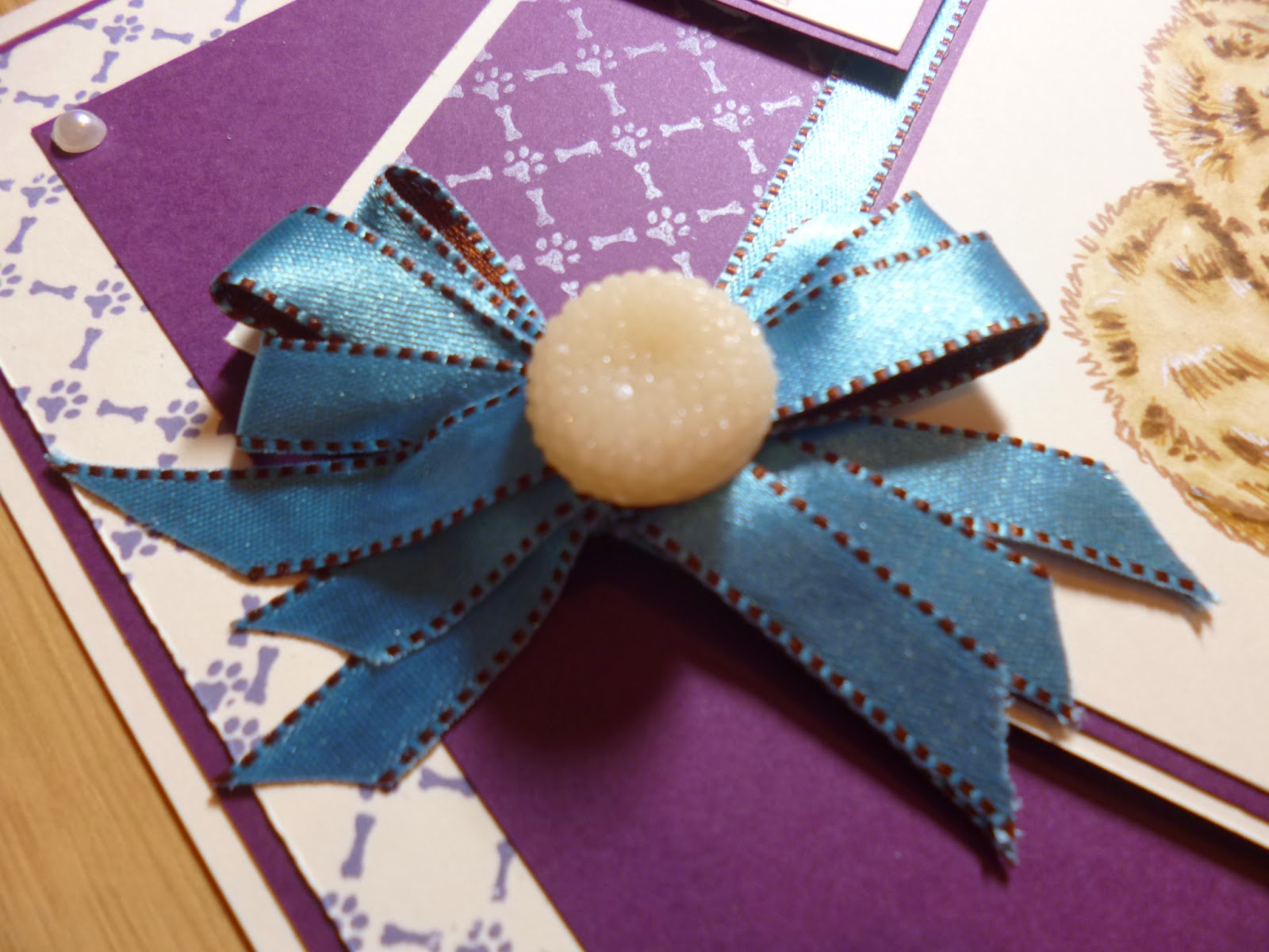
Showing posts with label Paw print lattice. Show all posts

Thursday, 26 February 2015

Creative Expressions Thursday

Hello everyone

Thanks for all your kind comments on my card yesterday. Today is the turn of Creative Expressions and a step by step I did with the pet stamps that we used last month I thought I would show you this tutorial that was featured on the step by step worksheet we also create for from time to time I really loved this card I created and wanted to make sure you all got to see this one too for those who didn't see it featured on the worksheet.

So without further ado here is this cutie.
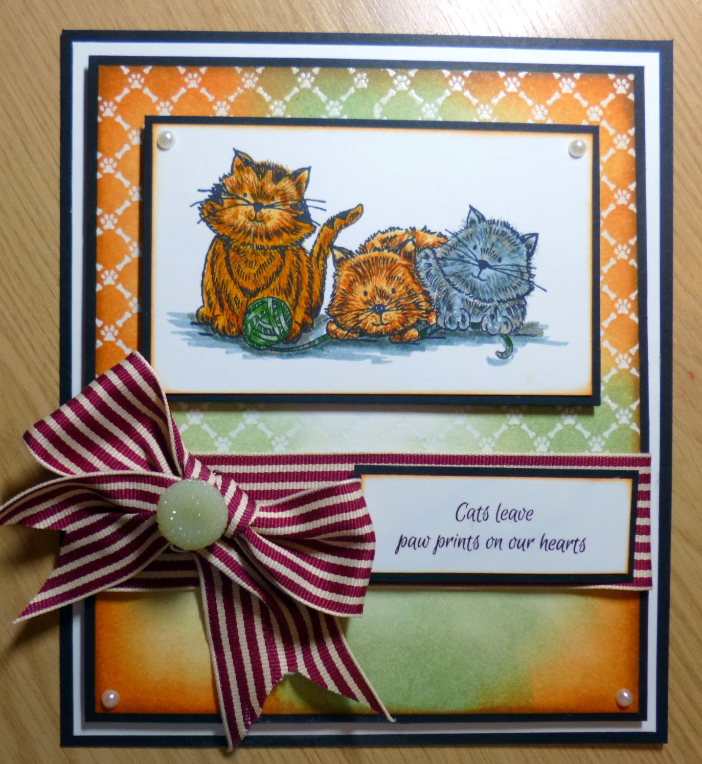
I loved creating this one I used the Paw print lattice background stamp with a resist technique with clear embossing powder on white card before the inking process.


So to start I took my Backing stamp and covered it in Perfect medium sticky embossing ink and coated a piece of white card stock  I used as detailed above the clear detail embossing powder form Creative Expressions and heat set it of course.


 Next using these four Distress inks I created a Backing wit more of the Bundled sage centrally and the oranges and the Vintage photo on the very edges.


Using Jet Black Archival ink of course I stamped out my Image called 'The Triplets'. I think of all the pet images we used for January this was my favourite for sure.I heat set it to stop the ink from smudging with water based ink. I also stamped a matching sentiment.

Using Distress markers I began colouring this one.


 I always try to use three of each shade to give shadows , highlights and a main colour. Its great fun adding tiny fur strokes and bringing these little fella's to life.
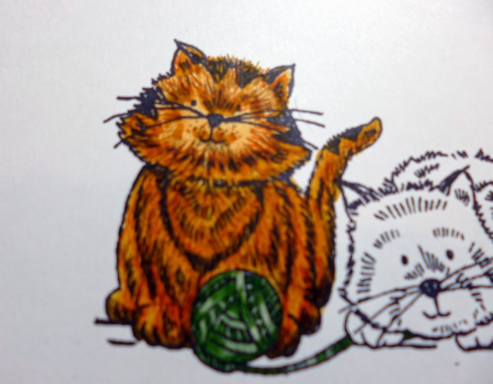

Each stroke of the fine tips adds depth and brings the character from a flat 2D image into a lifelike 3D image , I also used some white pen to open up the face and a white gel pen to add highlights in the fur also It is difficult for the camera to pick it up but it really does make a lot of difference and raise the image from the page creates the illusion to fool our eyes anyway.


I also added a shadow or two to ground the image and stop the cats looking like they were floating on the white back ground  I used again three shades of alcohol marker to 'ground' these playful little chaps. Once coloured I mounted each piece onto a thin border of black card.


After adding these onto black I took my background I created earlier and also added it to black card and made a slightly larger black and white mat also. Using foam on the inked back ground I added each piece together wrapping a piece of thick ribbon around the lattice piece also.


This is what the background should look like finished ready for the main image and sentiment.


I took a close up of the finished coloured image with shadows and highlights etc.


 I added my sentiment onto the ribbon strip and tied a matching bow with an opaque green dazzler to cover the knot. I cut the ends into forks for that real chocolate box shape bow.
I of course attached all the pieces using Cosmic shimmer glue which I love.


The finishing touches were just a few pearls and this little card was complete.


Here again is the completed image.
I was really pleased how this one turned out with its vibrant colours and how all the colours went together so well. I certainly never thought this ribbon would look so lovely on the card but I love it.
I hope you enjoyed how it was put together and the colours I used to colour the images and match the backings. They are some of my ultimate favourites to blend.

Have a wonderful Creative Expressions Thursday and I will speak to you all very soon, next months DT pack is so stunning and I love it so look out for the coming images from the team next month with all the gorgeous images.

Lots of love

Kim
XXXX

Thursday, 22 January 2015

Creative Expressions Thursday.

Hi Folks/Blogglies

Thank you all so much for all your kind wishes and lovely messages on yesterdays post as always and miraculously I think you all made the cold go away  as this a.m the car had no ice on it at all , you are all totally magic my friends.... hehe

Today I have a little fella for you to meet hehe, as you all know this month on The Creative Expressions DT we have a bit of an animal/friend theme going on and so today I have little Charlie for you to meet.

I have used my favourite colours of card and colouring technique with distress markers so without further ado ( does anyone know where that saying came from 'Further Ado' I mean who just suddenly said that ? I bet all his or her friends looked at him with an ... ooooo get you type look hey...? ( can you see where my mind diversifies off too hehe)

Here's Our little boy... Meet Charlie.

 I have lots of closer ones as we go through the post but isn't he just adorable. I used my fav Plum card paired with Milk card stock. I used Cornflower blue and coffee Archival inks to stamp my background and my sentiment respectively.
So to start I stamped out the little fella twice and snapped a photo so we can compare at the end.

 I chose my colour of distress pens as I knew I was going to do him a browny sand colour so I chose three browns and I wanted his ribbon Purple so I had a couple of purples and a white I will add a photo of all the colours used as we go along too.

 I took a piece of Milk card and stamped my Paw Lattice background around the edges I wasn't fussed if it over lapped or anything like that as long as it was not twisted in the pattern.
I then added a piece of plum over the top in the centre to create a base for Charlie to sit on.
I also Mounted the whole thing onto some more plum card and them milk again to give a nice frame around the whole thing. I set this aside to colour Charlie next.

I started with his bow to match him to the backing card so I used Dusty Concord, Seedless preserves and Picket fence to spread some colour from the darker ones to give us a third shade of purple for dimension. Whenever I choose colours I always work in odd numbers like three of 5, the same as flowers etc added to a project it just seems to sit better in odd numbers.

The colours I used for Charlie were.
Antique Linen,Brushed Corduroy and Gathered twigs which is one of my fav brown combo's for hair too.
 

'Charlie'

I started by adding antique linen to all the areas with shade lines and shadowy areas, ie: on the edge of his paws and under and folds in his coat etc. Then I used Brushed Corduroy to add some extra hair strokes on top of the areas just coloured and once dry go back in with the antique linen and colour over the strokes and areas just done, as you all know distress markers are water based so you will need to have good quality card or the paper will disintegrate as you colour over it a few times But foundations card stands up to all my inky Bullying very well. Once I had those two colours done and dry I brought in some of the darkest shade, gathered twigs, I used a few hair strokes on his nose and ears and places like paws and tail and any shadowy folds too.I also used a white pen yes my trusty white pen I couldn't manage without this and my white drawing ink and fine paintbrush too. I use these to highlight eyes and noses and any shine i need on fur/hair etc all the time.

So here is how the two pics looked together for comparison.

Bit different? 

So I cut him out of the card and mounted him onto a larger square of plum card, I used a white ink pad to stamp the paw print lattice again onto the top of that plum card and then mounted the whole thing onto more Milk card. I used my reversible brown and blue Ribbon from Creative Expressions and wrapped one piece around the gap where the two card stocks met.
I raised this piece up on foam and added it on a jaunty angle onto the card base we set aside earlier.
I took a small piece of milk card and stamped with archival ink a sentiment from the Paw prints on your heart sentiment, clear stamp pack. It says.

" Until one has loved an animal, a part of one's soul remains unawakened. Anatole France."

True true....

So I mounted that also onto plum and foam and added that onto the top right of the piece just added to the card.
So I wanted to add a tripple bow with this lovely reversable ribbon so I tied my bow but of course one of the tail sets always ended up Brown so once I had secured it into place with a sticky glue dot I added some double sided tape to the front parts of the brown tails and added some ribbon the right colour up and trimmed it so it looked like the other side. I added a Peach opaque dazzler to the centre of the bow as it seemed to match Charlies coat nicely.
So lastly was just a few extra embellishments as always, you know me I just love embellishments of all kinds.
 I used this little Wendy Vechi resin heart  for the bottom right It had red spots on it so I coloured them in with purple chalk paint and added a little  wax in gold to bring out the carve marks on the resin ( you never have to use embellishments just as they come, doctor them and change them to suit your projects.

 I took this picture of charlie on an angle simply to show with shading in the correct tones and areas you can actually tilt a picture and it will look like it is coming out of the page like the car I did back on the blog ages ago for Visible Image if any of you remember gradients of shading is what pushes an image back or forward the rule to remember is  Dark recedes an item into the back ground, Light highlights and brings it forward. I will do more on this in the coming items on the blog to help you all colour better.


So here is the finished card again with just a few pearls to finish off the corners. I hope you liked it and are getting to grips with my colouring explanations ok.

A nice little card with a few tricks but nice and not too complicated to copy should you want to do something similar. 

I have answered all yesterdays comments left so far so if you left a comment please come on and check for replies as I do try hard to keep up with them all, I know it isn't always possible but I do try every time.
Keep warm everyone and have a wonderful Thursday my Internet family  I am planning to have a review day on the blog where I review a craft item possibly weekly or every other week and so I am looking for thoughts on things like inks, stamps , embossing etc  so we can see what is well made etc. Please let me know if there is anything specific you would like to see. 

Lots of warm hugs 

Love
Kim 
XXXX


Thursday, 15 January 2015

Creative Expressions Thursday.

Hello lovelies..

Thank you all for such lovely comments yesterday  I really am very appreciative of all your kind words and I answered them all so far yayyyyy, it felt so good to communicate with you all again haha
I truly feel so blessed to have each and every one of you here with me and your kindness really supports me and touches my heart. It really is such an honour to read and reply to your comments.
I am looking forward to catching up with all your emails too.

On to today's lovely little card, isn't that Kitty a cuttie haha..


So please meet Poppy ...


This is another clean and simple card with lots of matting and layering which keeps your eye straight on poppy in the centre but then your eye will wander to the butterfly  and flower with the tiny pop of colour, I gave her a little shadow too which all helps with the illusion of a bright day. The shadow actually continues all around Miss Poppy which kind of lifts her from the card but you do not notice it at first glance. Don't you just love little visual tricks like that? or is it just me haha..


Here is another view to peak at the gorgeous backing stamp, its in the A6 size and it extends beautifully as you can see, the lining up is sometime hard with rubber stamps but this one is quite easy as you can see where the little paws are on the edge of the rubber if you lean over. I love this background, its called The Paw print Lattice stamp. If you look closely the lattice part is little bones so you can use this for the dog stamps in the range too, clever.


 So I stamped Poppy in archival and heat set her. ( bit anthropomorphic but I feel like the characters do come alive once you have stamped them haha).


I coloured her very subtly with my Distress markers  I used antique linen for her fur. I brought in just hints of colour, which seem much more vibrant in person, but I used a combination of the pink range of distress and the green and my trusty white pen to add some little dots on the flower and the kitties eyes etc, again little things that you do not notice but all help in the realism in adding a little shine or light etc.Lastly I used an alcohol marker to add her shadows to bring her forward on the page.
Once she was coloured I added her to a layer of black card, as this card was in all white and black.

 So next I added my sentiment which I thought about keeping for the doggy stamps in the range with the 'Ruff ' in the words, but then I loved the cuteness of Poppy with the words so thought well its my card so I am gonna add it. haha.

 Then came the tricky part of practising lining up the stamp, as I said you can get it to line up really well as I discovered later by looking to the side of the stamp and seeing on the edge where the paw lines up but at first I just randomly stamped and hoped, so in the spirit of not wasting it, I knew I just needed the outside part as the centre would be covered with matting and layering and Poppy.
Once I got this and knew the centre totally did not matter , I mounted it onto black card again.

 I took my sentiment card and mounted that onto black also and added foam to raise it from the backing card , lining up the edges to keep it even. I just love the simplicity of it.


I added more foam to the back of the main image piece and added that to the card, allowing for the sentiment to sit in the centre of that layer too. and last to finish four little flat backed pearls in the corners of layer two. I am very pleased with her as every time I coloured her before this I used many more shades and gave her a total filled image but I really wanted to try this subtle colouring technique and then the bright flowers. The last thing I did was to use a black pen and give Miss butterfly in pink a black dotty trail as butterflies look so cute with them in my opinion.

What do you think?, do you prefer totally coloured images or do you like the simplicity of the shading method? let me know in the comments, its so interesting to hear all your thoughts and I will be answering them as I did with yesterdays too.

As I type this it is torrential rain here in Hertfordshire and soooooo cold. I really do not like winter at all and will be so glad once spring starts to appear round the corner again, lighter nights and not stepping out of work to street lights and dark nights will be a wonderful thing for sure.

Anyway all I hope you liked today's Creative Expressions stamps and card and I look forward to answering your lovely comments and getting back on the blogging track again.

Love and crafty hugs to you all 

Kim
XXXX