
Happy Thursday, I am so glad this is a short week aren't you?
Although the sunshine is soooo good to see especially as I left work at 6pm... and the sun was still beautiful yesterday.
I wanted to pose a question to all my lovelies, when you are all looking at the blogs do you prefer to see lots of step by steps in photos or do you prefer a quick description of how a card was made?
I guess I was wondering if you find it helpful all the step by step pictures or if its overkill as it were and you may be thinking we don't want so many snaps, if you could let me know I would be very grateful folks.
So today is of course Creative Expressions day and I have been using some lovely spring colours to match the stamps for this month.
I really love this colour combo and the richness of the oranges, Orange used to be a colour I reached for last in my collection as I used to have a real adversity to it but this last year I have really started to enjoy it, Isn't it funny how our tastes change after years of not liking something.
So here is the little creation for today , see what you think?


These are the coloured inks I used for this one. Wild honey,Rusty hinge and Salty Ocean.

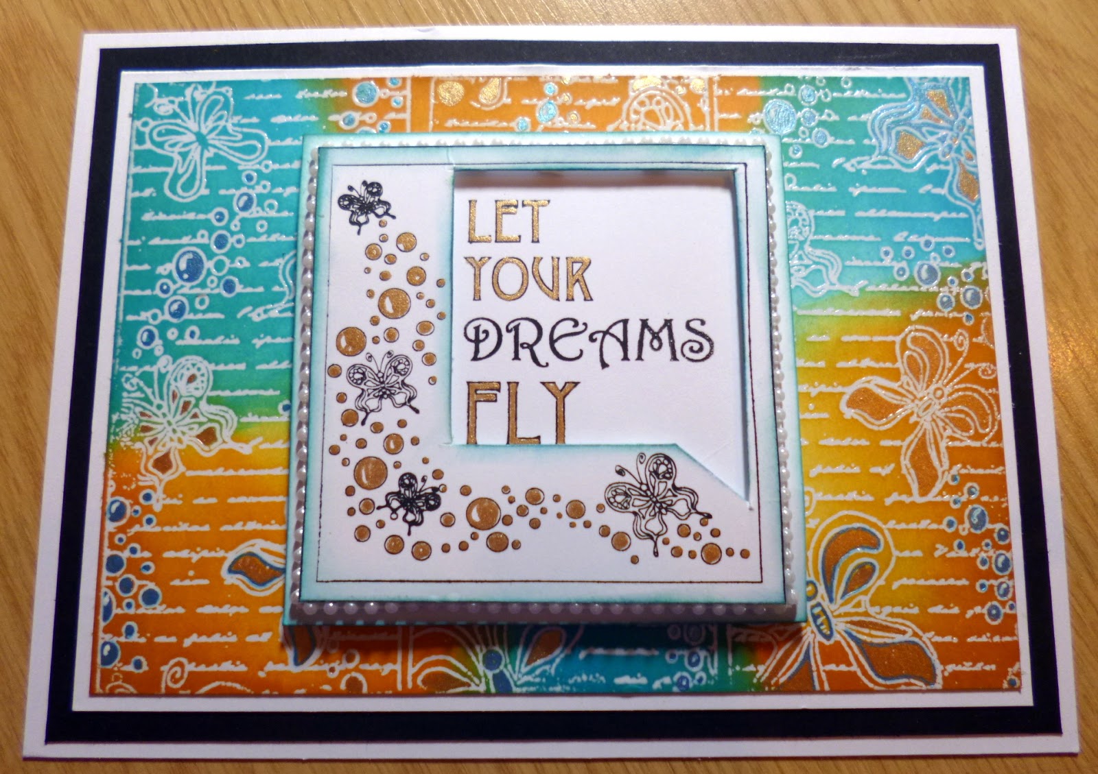
I took a piece of white card stock, The Butterfly dreams Striplet from the Stamps to die for range from John Lockwood and stamped it three times, in a row but hanging it off the edge of the card as I was avoiding getting the border in, I also used Perfect medium and some clear embossing powder and heat set it just so it will resist the inks above wen we colour the background.

I coloured the background in my usual way , I love layering the inks too, so I begin with getting the first coat on the card which is always patchy with a few marks and edges in because your aim is to get the card damp at this stage so we can blend the inks so do not over think this layer , It will look messy but it will come together folks.
add the next layer of ink which starts to smooth the colours , then go back with the deeper colours or the same ink and deepen the edges to give depth and a nice graduated blend on the edges as you see above.

Once colouring is dry decide what colour mat and layering you will do and add them to the backing too.

At this stage I used a little gold and blue paint for the inside of the little circles and also a white highlight on the larger ones I think they look a bit like bubbles but that's just my interpretation. I then set this piece aside to work on the centre piece.

I stamped out the Butterfly dreams square image from the Elements set also called Butterfly dreams by John. and coloured the bubbles to match the backing but I left the butterflies white. I cut out part of the frame as you see above , I placed it onto another piece of white card and positioned where my frame would fit the card and stamped the words through the frame. I then painted in the letters in gold.I also added a tiny bit of the blue to edge both pieces of card.

Once dry I added the frame to the sentiment piece with foam in between, and added it to the back ground piece too. I thought it needed a little something as I knew I wasn't adding bows or other elements as I didn't want to cover all our ink work. I decided on some white pearl strings from the CE range and glued a little strip around the edges of the central piece. Bit fiddly but so worth it use tweezers if your fingers are getting in the way here . Pre measure and cut your strings , it does make life easier then trying to cut then while the glue is tacky.
This is what it looks like at this stage.

Here is another angle so you can see the image better.
I decided it still needed something so I took the butterfly Image from the set and stamped it in black archival 6 times to make three double layered butterflies.


I coloured the little piece of card with matching inks in random patterns well splodges really just so each butterfly had a small mix of colours. I then set to cutting them our by hand and I didn't do it super neat, once cut we don't want white edges so I took a piece of cut and dry foam and inked the edges to match and added a little Glue to the centre of the bottom layer and pinched up the wings on the second layer before adding to the lower one, as below.

I added just a little twinkle to each but didn't go over board with it as I wanted your eyes to see the background not just sparkly butterflies. I glued in a small piece of the pearl string to each one for the body. I then added them on the card.

I took some glossy accents and added a small drip to each of the little circles on the card to give it a raised droplet kind of effect , once dry they did drop a little but still looked lovely and very textures to almost make you want to run your fingers over the pattern.
So that completed the card and here is the main image again.
once last image shows you from side on how the bubbles are raised etc.

If you didn't want to add the glue to the centre of the bubbles you could use your pearly glues like our Julia does on her cards or you could used some little pearls in different sizes with the same effect but more of an opaque silhouette rather than clear as I chose , I wanted the colour of the paint below to come through like a bubble I guess.
Okay lovely Internet friends I hope you liked this one and I will see you very soon, don't forget to let me know if all the pictures are more helpful than a worded description or if you would like to see both or how you would prefer it, I consider this our blog not just mine and what you prefer to see is not only helpful to me but Its nice for you all to have an input too. I like having the photos for my reference anyway but its whether they are helpful more than anything to you guys.
Ok have a lovely sunny Thursday.
Love to all.
Hugs
Kim
XXXX
Beautiful card Kim, I love these colours.
ReplyDeleteAlso the stamp , I have the central one but not the strip stamp, they look great combined!
I like the pictures , they help , but if you did less it would still be ok !
Have a good week,
XxxRuth
Morning Kim
ReplyDeleteStunning card, love these stamps, haven't got them yet.
Love your words and pictures, really helpful
Hugs
Carol x
This is really beautiful Kim and love the blue and orange together and the stamps are lovely. There is so much interest too with the added colour and glossy accents on the background and the gold on the sentiment and the pretty pearl string round the edge. I think if it is a very complex card then the steps with more photos are a good idea, but perhaps if a card is fairly straight forward then you could cut back on the steps. Doing everything in such detail is a lot of work for you too Kim so sometimes you could make it simpler. At the end of the day it is your blog Kim and you must do what feels right for you. x
ReplyDeleteAfternoon Kim, This is a stunning card, I love the combinations of colours used, I adore John's 'bubble' stamps, it was the bubbles that appealed to me, and I love your use of colour on the bubbles, with the glossy accents on top, gorgeous.
ReplyDeleteI love your step by steps, sometimes when the card is quite intricate I do have a problem with just the written details, and the photos really help, but if a card is quite straight forward, then that would be quite easy to follow with less photos.
Lots of love from Patricia xx
Afternoon Kim, This is a stunning card, I love the combinations of colours used, I adore John's 'bubble' stamps, it was the bubbles that appealed to me, and I love your use of colour on the bubbles, with the glossy accents on top, gorgeous.
ReplyDeleteI love your step by steps, sometimes when the card is quite intricate I do have a problem with just the written details, and the photos really help, but if a card is quite straight forward, then that would be quite easy to follow with less photos.
Lots of love from Patricia xx
Evening Kim, beautiful combination of colours and such an intricate card. The photos are very helpful when there are a lot of steps to folliow, although I do find they don't all open on my IPad so I can either read the instructions or look at the photos but not both together if there are a lot, but that may just be my problem. Hope you had a good Easter.
ReplyDeleteHi Kim,
ReplyDeleteLovely card, stunning colours, love your idea of glue to create "water drops". Your background, as ever, stunning. Love your focal point, too.
Re your question: I could easily manage with far less step to step instructions and prefer a detailled description with a few close ups of the intricate details of the card. Obviously, we need to see a photo of the complete card.
Certainly, a photo of the inkpads is superfluous.
Hope this is the sort of feedback you wanted.
Hugs, Rose
Not sure a sometimes ai see straight away what you've done other times I need as much step by step guidance as possible! Like today's I like to see how background SHOULD look like etc
ReplyDeleteHi kim this card is stunning I love the colours and the pearls are lovely thank you for sharing. I love the blog the way it is the pictures are great love to you and yours nanna June xxxxx
ReplyDelete